This site. Built to show the work, not describe it
amirbrooks.com.au · historical portfolio capture
Embedded legacy metrics are retained as interface history, not current performance claims.
02 · Project brief
About this project
Role
Product build
Type
Web App
Status
Live
Category
products
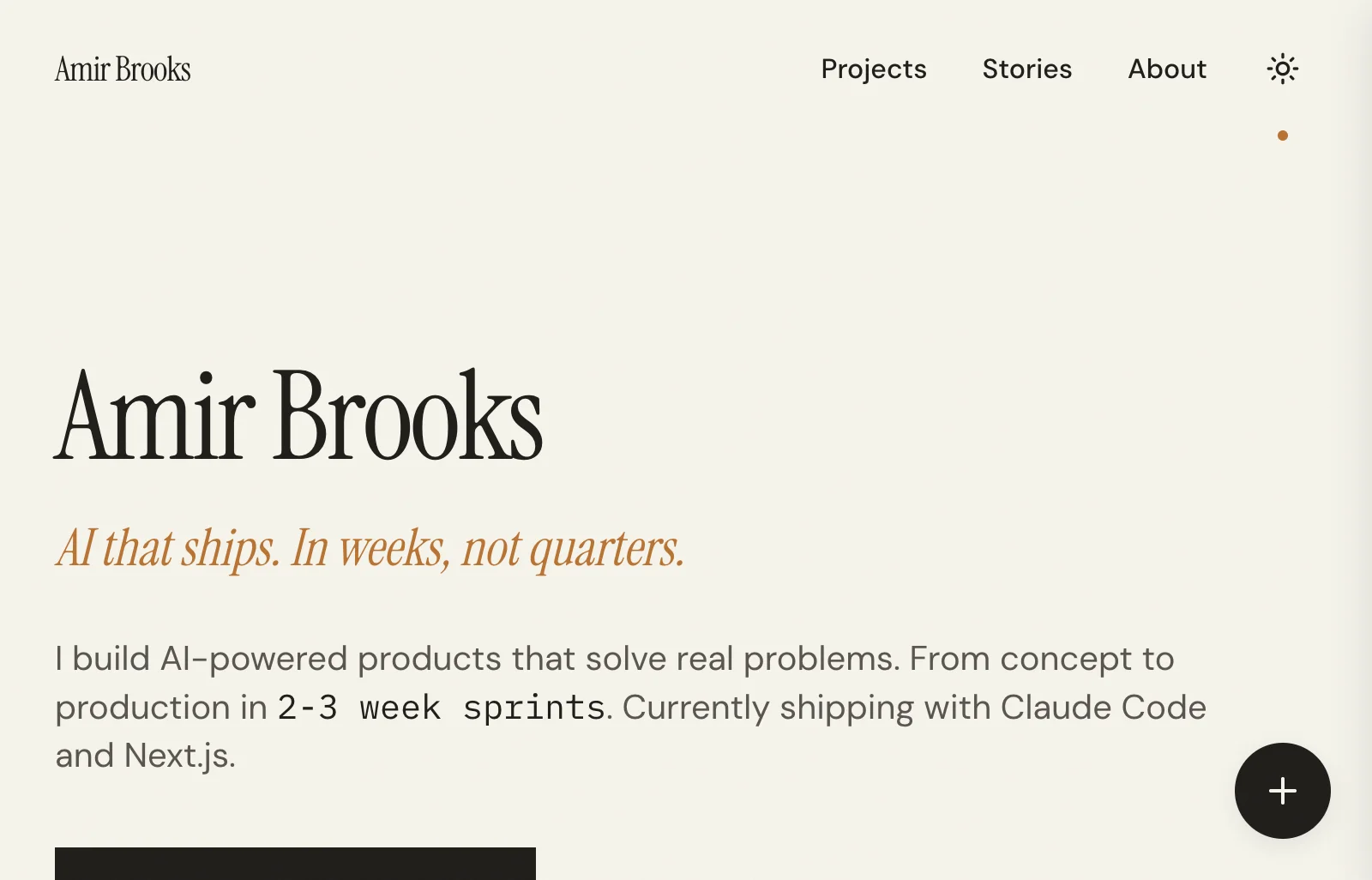
A ground-up rebuild of my personal portfolio, designed to put projects front and centre. The current site uses a restrained editorial homepage, wide real-product captures, selective public navigation, dedicated project detail pages, and a fast-scanning work index. Built with Next.js 16, React, TypeScript, and a portable Amir design system.
03 · Capabilities
04 capabilities
What I built
01
Project-first structure and navigation
02
Simplified layouts and content hierarchy
03
Responsive design across breakpoints
04
Reduced UI and architecture complexity
04 · Product screens
03 views
Inside the build
05 · Build details
Technology & access
Technology
Next.js 16
React
TypeScript
Tailwind CSS
shadcn/ui
Coolify
06 · Contact
Got a product that deserves to be ready?
One conversation is enough to know whether this is a fit. Tell me what needs to work better.